On a NASCAR Sunday, forty cars can look almost the same at 180 mph. The bodies are built to tight rules, the paint schemes change from week to week, and the sponsor names cover most of the sheet metal. So how do fans know which manufacturer is which? Largely through the small details: the shape of the nose, the headlight graphics and, above all, the badge. For the three makes currently in the Cup Series, the logo is a huge part of the story.
If you like looking at how these emblems evolved over the decades, you can browse car brand logos and their history in one place, which makes it easy to compare the badges on the grid with their older versions.
Why logos matter in a spec-heavy sport. Modern NASCAR is built around close competition. The Next Gen car, introduced in 2022, uses many common parts, which keeps costs under control and the racing tight. That also means manufacturers have limited room to stand out mechanically, so brand identity depends heavily on appearance. The old saying “win on Sunday, sell on Monday” still describes the logic: a recognizable badge on a winning car stays in a fan’s memory and can influence the next purchase.
Chevrolet: the bowtie. One of the most recognizable symbols in American motorsport. The bowtie has appeared on Chevrolet products for over a century, and its exact origin is still debated, with several stories attached to the company’s early history. In NASCAR, the gold version of the bowtie has become closely associated with the brand’s racing programs. Chevrolet’s Cup entry is the Camaro ZL1, which took over from the SS in 2018.
Ford: the blue oval. Ford’s oval has been part of the company’s identity since the late 1920s and has changed only in details since then. Its white script on a deep blue background is easy to recognize even when it is small. Ford has raced the Mustang in the Cup Series since 2019, and the Mustang Dark Horse became the body style in 2024, linking the race car to a model that fans can actually buy.
Toyota: three ovals. Toyota entered the Cup Series in 2007 with the Camry, becoming the first Japanese manufacturer in the sport’s top level in the modern era. Its emblem, introduced in 1989, consists of three overlapping ovals. The company explains the two crossing ovals in the middle as the hearts of the customer and Toyota, while the larger oval around them stands for the world. On the track, the badge sits on a sharp, aggressive nose that makes the car easy to spot.
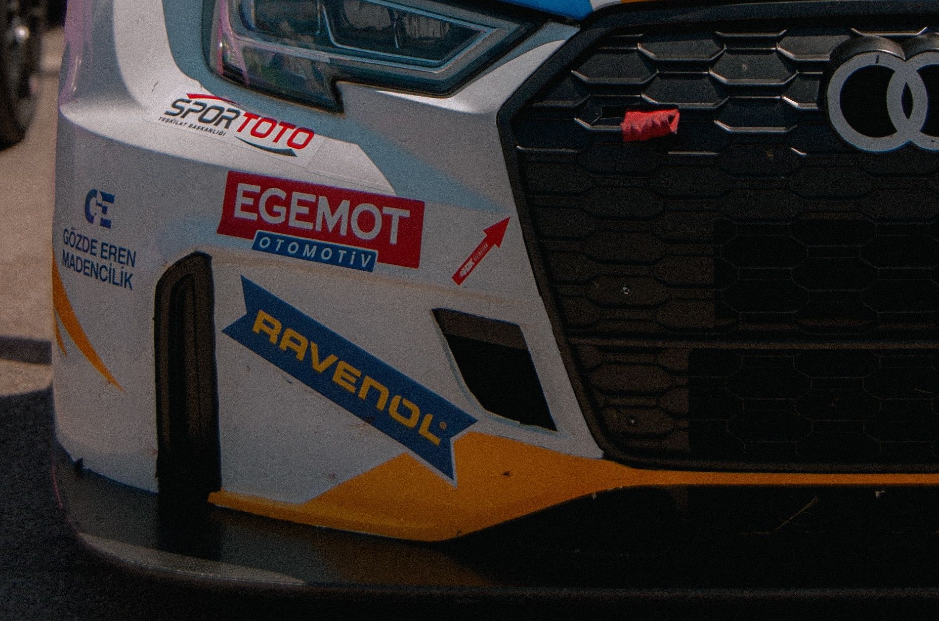
Decals, noses and the “stock” question. A modern Cup car is not a road car with a roll cage. Many elements that look like real headlights and grilles are printed graphics, and the body panels are shaped to follow the series’ rules while still carrying each brand’s design cues. That is why logos and nose shapes matter so much: they are the main way to tell a Camaro from a Mustang or a Camry at a glance, especially on TV.
What fans notice first. Experienced viewers use a few quick signals:
- the badge in the center of the front end;
- the shape of the front fascia and the headlight graphics;
- the color of the contingency decals on the quarter panels;
- the manufacturer name in the broadcast graphic.
Newer fans usually start with the team and the number, then learn the brand from the logo.
Logos beyond the car. The same emblems show up in pit stalls, garages, hospitality tents, merchandise, die-cast models and video games. Manufacturers invest heavily in these touchpoints because racing is one of the few places where a car brand can be seen alongside excitement and competition for several hours a week.
The bigger design trend. Over the last few years, many automakers have simplified their road-car logos into flatter, cleaner versions suited for screens and electric vehicles. Racing is more conservative: classic, detailed versions remain popular on race cars and fan merchandise, because tradition is part of the appeal. The contrast shows how motorsport keeps a link to its history even as road-car branding moves toward minimalism.
Whether you grew up on the Chevy–Ford rivalry or came to the sport through Toyota’s rise, the badges on the cars carry a lot of meaning. The next time the green flag drops, look at the front end before you look at the number. The logo is telling you who is racing.